BACK
Jun 16, 2025
Designing the Brand Systems That Power Crypto’s Frontlines
When the products are built to move billions — the UI can’t just look good. It has to move like a machine. And feel like a story.
This case study is a glimpse into the brand systems I built from scratch for three products operating at the edge of crypto and automation:
Tether’s Bitkit Wallet
Biconomy’s AI Agent Nomy
Igris – A multichain execution bot
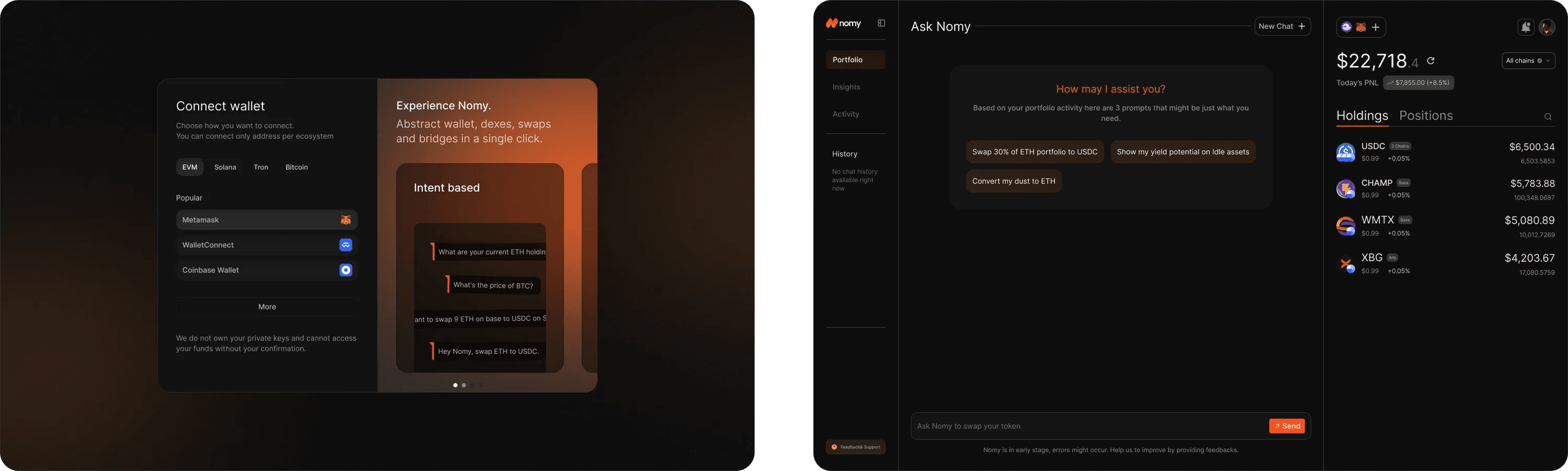
🧠 Biconomy’s Nomy — Design for an Autonomous Agent
Biconomy was launching Nomy, an AI-powered DeFi assistant.
The product was powerful.
The problem? There was no design layer to match the intelligence.
In this example, we’re implementing three key optimizations:
Biconomy was launching Nomy, an AI-powered DeFi assistant.
The product was powerful.
The problem? There was no design layer to match the intelligence.
What I Built
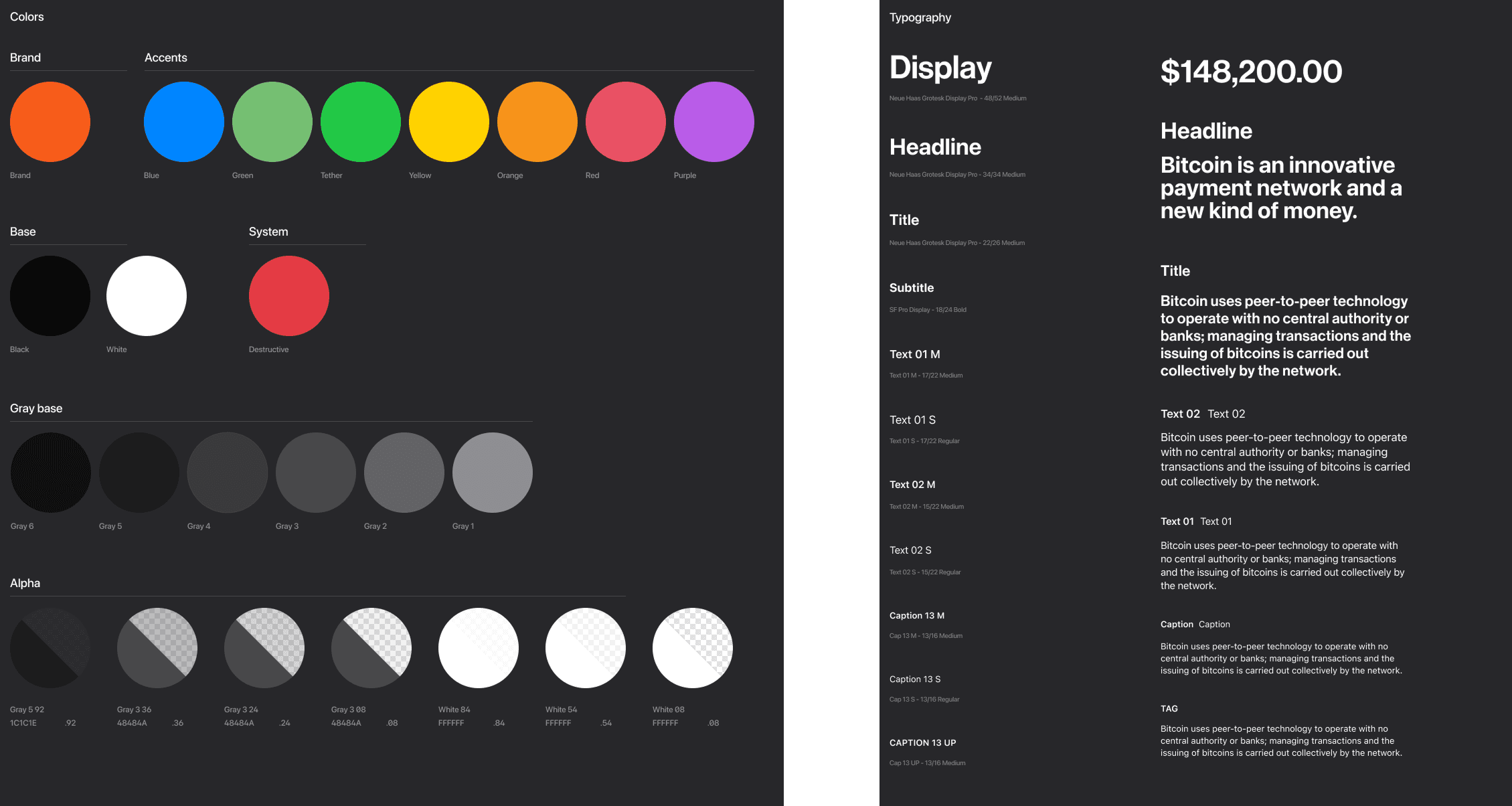
From zero to design system — with Figma tokens, typography scale, and dark-mode native components
Atomic components + smart variants for instant reuse
UX that felt like command-line precision with cinematic clarity
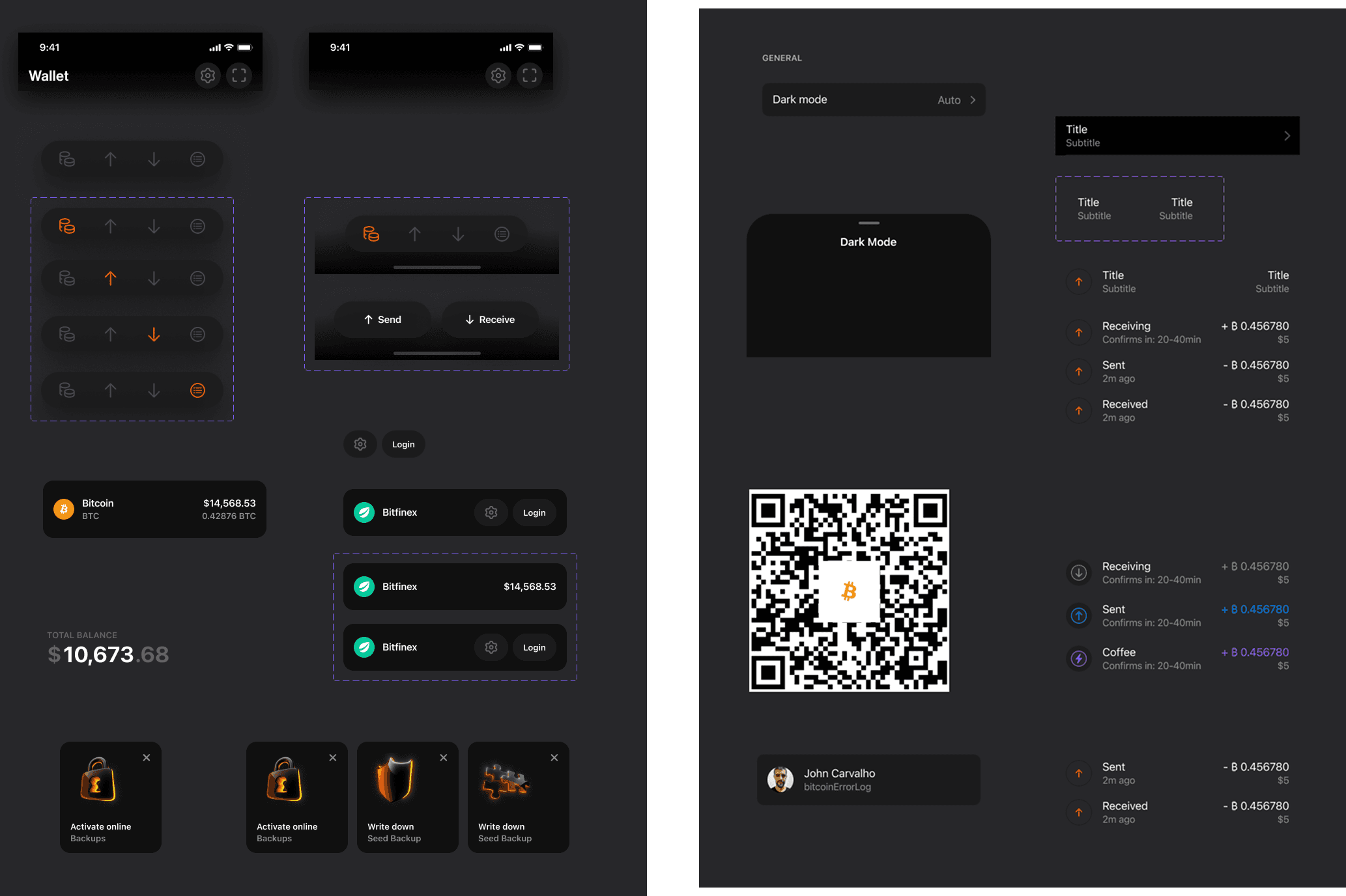
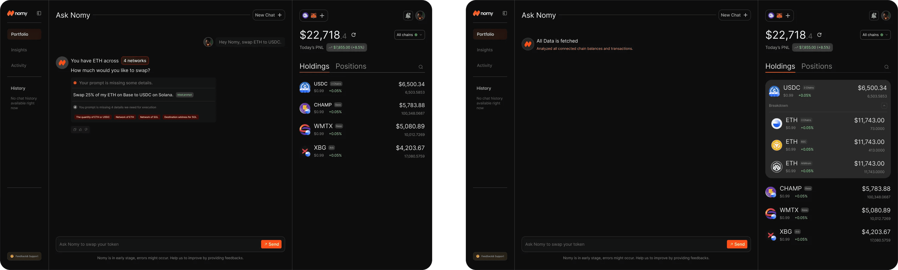
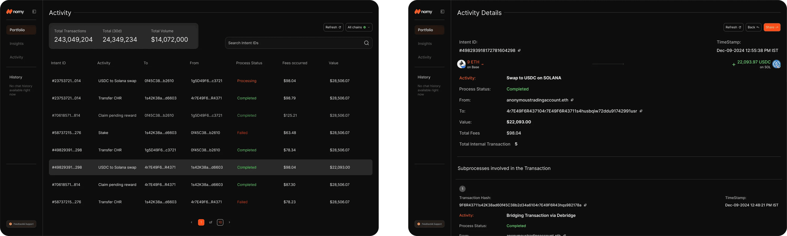
📸 Screenshots on page 2 show a zero-friction chat-like interface layered over wallet insights, intent parsing, and swap execution.
The vibe?
“Feels like you’re talking to your portfolio.”
Not a dashboard.
A co-pilot.
Design System:
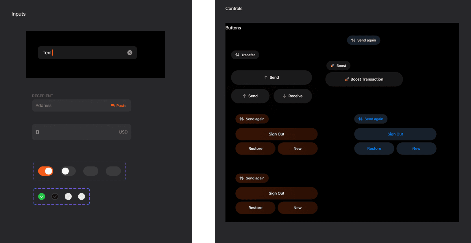
Component Library:

Screens :
🧰 Tether – Designing Bitkit from Scratch
Tether needed a UI for their new wallet — Bitkit — designed for privacy, speed, and real-world payments.
This wasn’t just about UI.
It was about brand gravity.
How do you design a wallet that speaks to both crypto-maxis and new users?
Designed wallet views, transaction explorer, and modals with deliberate spacing logic
Optimized every decision for mobile-first clarity and tap feedback
Built an onboarding flow that feels minimal, but dense with power
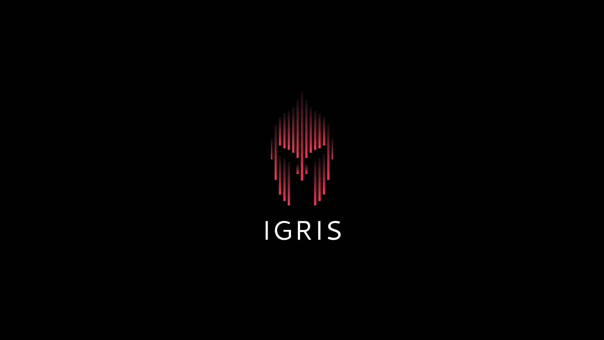
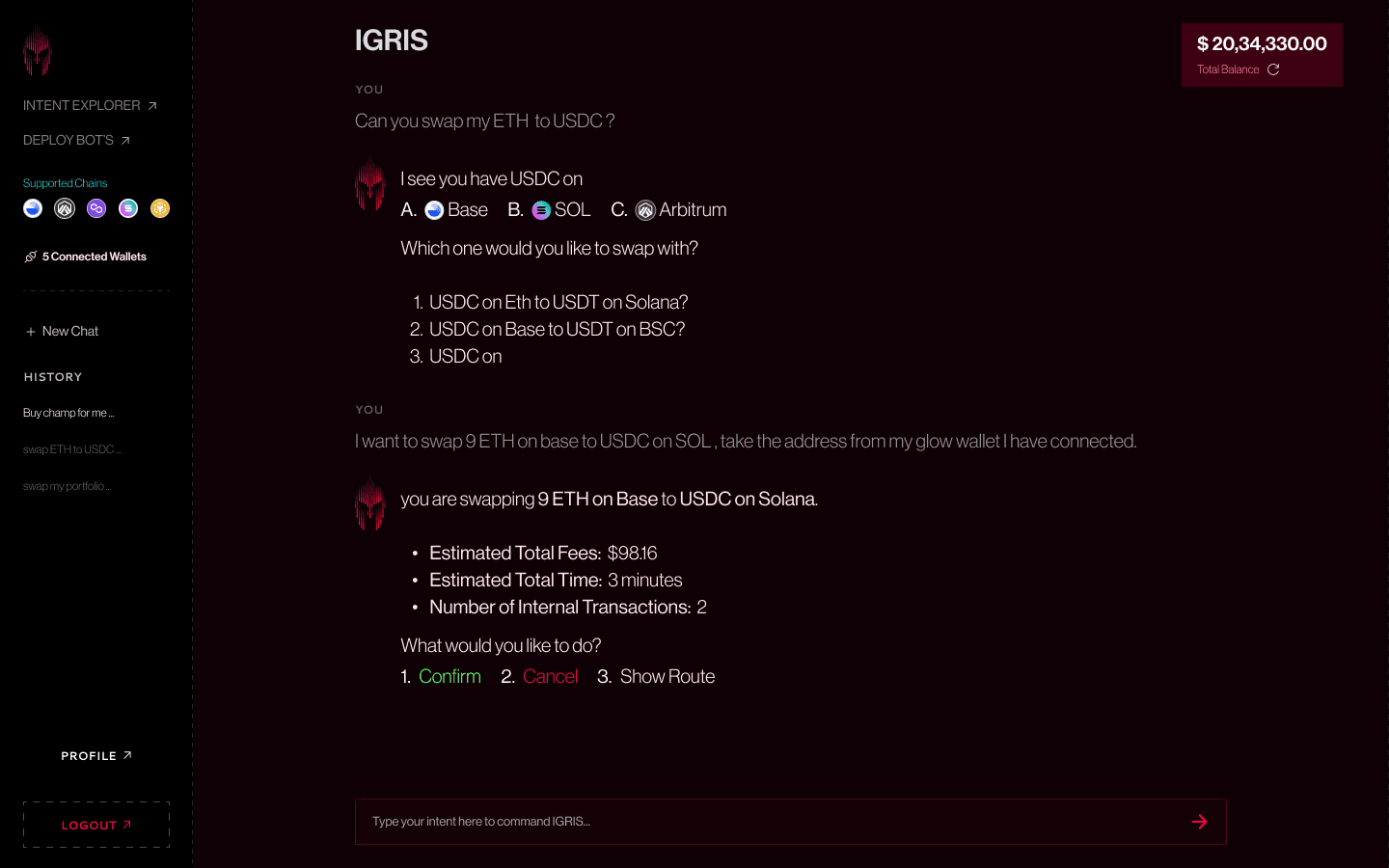
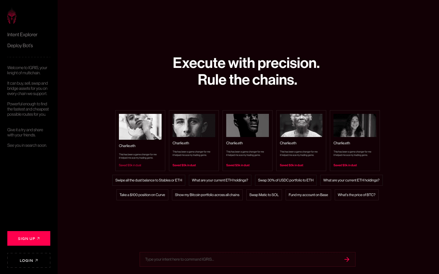
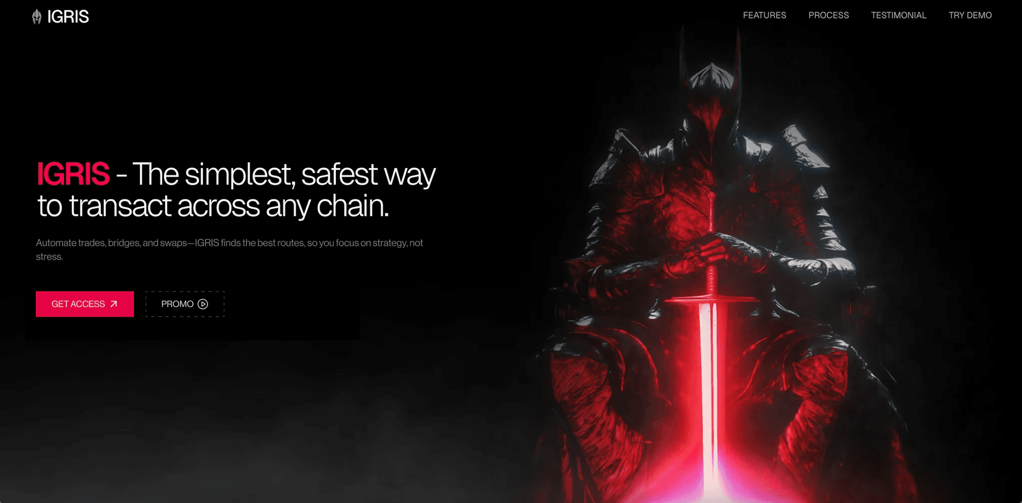
⚔️ Igris — Branding a Warrior, Not Just a Bot
Igris isn’t just a multichain execution tool.
It’s an AI warrior that helps users swap, bridge, and execute DeFi flows — faster than most people can think.
What I Crafted
Full brand identity inspired by Solo Leveling aesthetics
Dark, crimson, glow-stroked visual system
Hero image and UI that felt alive — like a bot that could fight for you
Modular typography scale (page 5) to support both HUD-style data views and narrative headlines
Igris wasn’t built to look clean.
It was built to feel powerful.
Favicon:
:
Logo:
Dashboard
Hero section of landing page
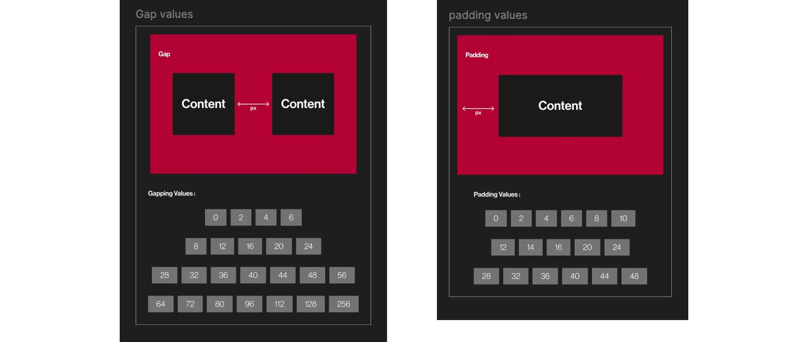
🧱 Behind the Scenes: The Design System
Across all three products, I built systems that:
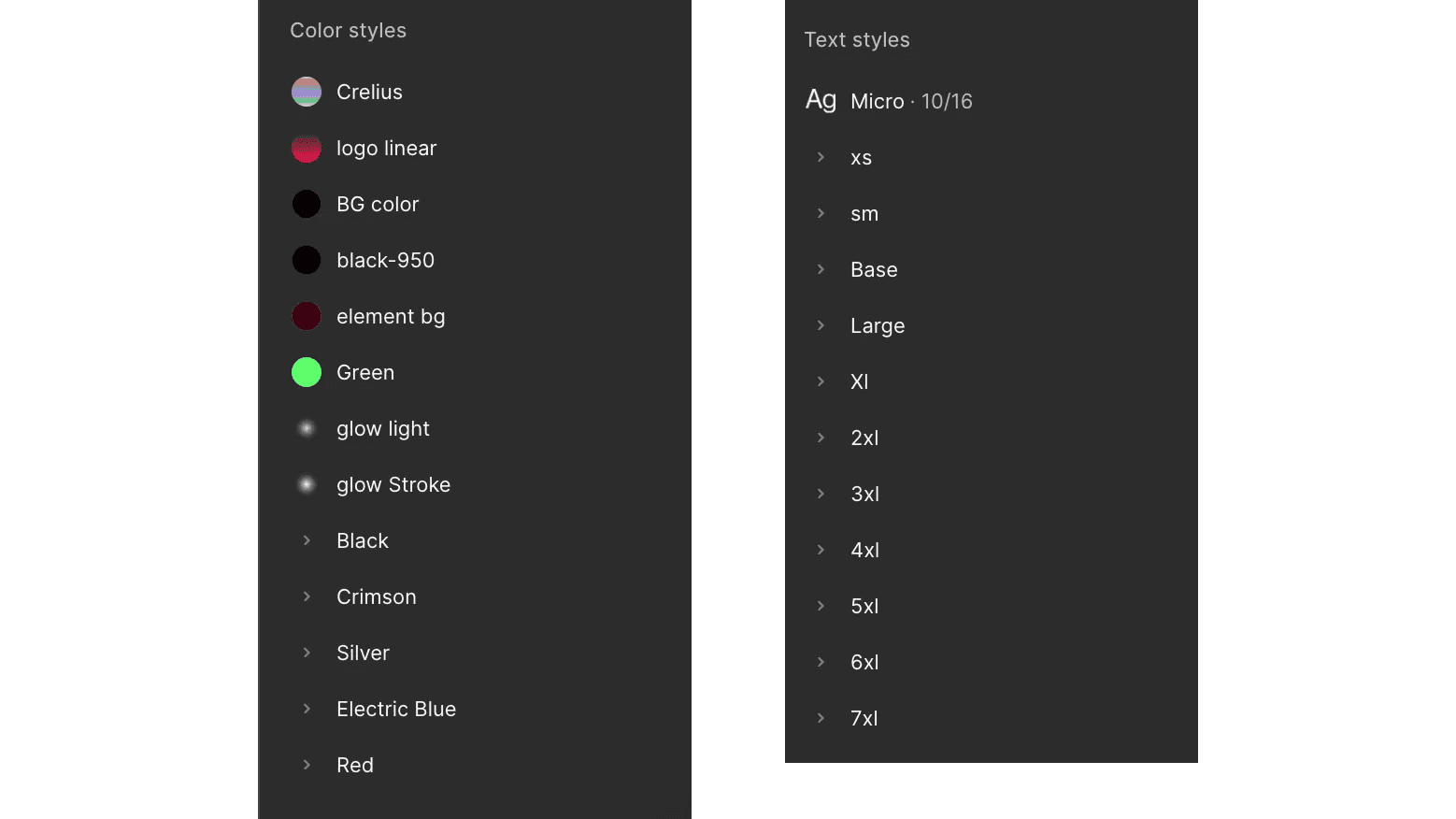
Used unified spacing scales
Employed reusable text+color tokens with names like black-950, glow-stroke, element-bg
Let engineering teams ship fast and stay consistent
Looked like design. Worked like code.
🧘 Final Thought
Designing UI for crypto infra isn’t about gradients or glassmorphism.
It’s about:
Building trust in milliseconds
Showing power without overwhelming
Giving users the sense that the interface knows what they’re trying to do
And then — getting out of the way.
If your product moves fast and needs a brand that doesn’t break at speed —
I’d love to help.
—
Varun Satyam
Designs for speed. Builds for clarity. Writes like it means something.
More